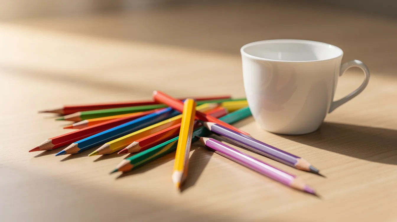
Pick a page with simple shapes, use a small set of pencils, build colour in light layers, sharpen well, work light to dark, and keep a relaxed hand. That is the short answer. The rest of this article is the longer, more useful one.
Getting Started With Colouring Pencils
Two winters ago I bought a coloring book from a charity shop for a pound. I had no plan. I just thought it looked nice, and the bakery had worn me out, and I wanted something quiet to do with my tea. That first page looked muddy and flat. I was sure I was doing it wrong. Turns out I was, a bit, but the pencils and the paper were also working against me.
I sat at my tiny table in Sheffield with a tin of school pencils from the back of a drawer. They were scratchy and pale, but they taught me pressure and layering before I spent a penny on anything better. Using what you already own shows you what you like and where your frustrations actually sit. That makes later shopping less of a gamble.
You do not need artist training, expensive kits, or a studio. You need a handful of colored pencils, any adult colouring book or printable page, and a sheet of plain printer paper for testing colours. That is genuinely it.
This article sticks to dry coloured pencils and pastel pencils. I will not cover watercolor pencils, water soluble pencils, or markers here, though watercolor pencils can be used dry or wet for different effects and are worth exploring another time. Same goes for other art media and every other medium that catches your eye later.
Here is what today covers:
-
Layering colors to build richness
-
Shading with a consistent light source
-
Choosing and testing your pencils and paper
-
Fixing mistakes without panic
What Are Coloured Pencils, Really?
A colored pencil is a pigmented core inside a wood encasing. The core is not actual lead. It is a mix of pigment, binder, and filler, shaped into a stick, dried (never fired in a kiln, because that would ruin the colour), and glued into a wooden barrel. Different brands have their own names for their lines, but the basic idea is the same everywhere. For more background, see the Wikipedia entry on colored pencils.
Most pencils on shop shelves are wax based. Wax based pencils are the most common type, and they use paraffin or similar waxes as binder. They feel creamy, blend easily, and are what you will find in nearly every student set. Oil based pencils, like the Faber Castell Polychromos, use a firmer binder. Oil based pencils are more durable and water resistant than their wax based counterparts, and they tend to hold a sharp point longer. On the flip side, wax based pencils are easier to blend and layer than oil based pencils.
My practical take: the wax or oil in the core is why you can build colour gradually. It is also why very heavy pressure leaves a slick, shiny surface that refuses more pigment.
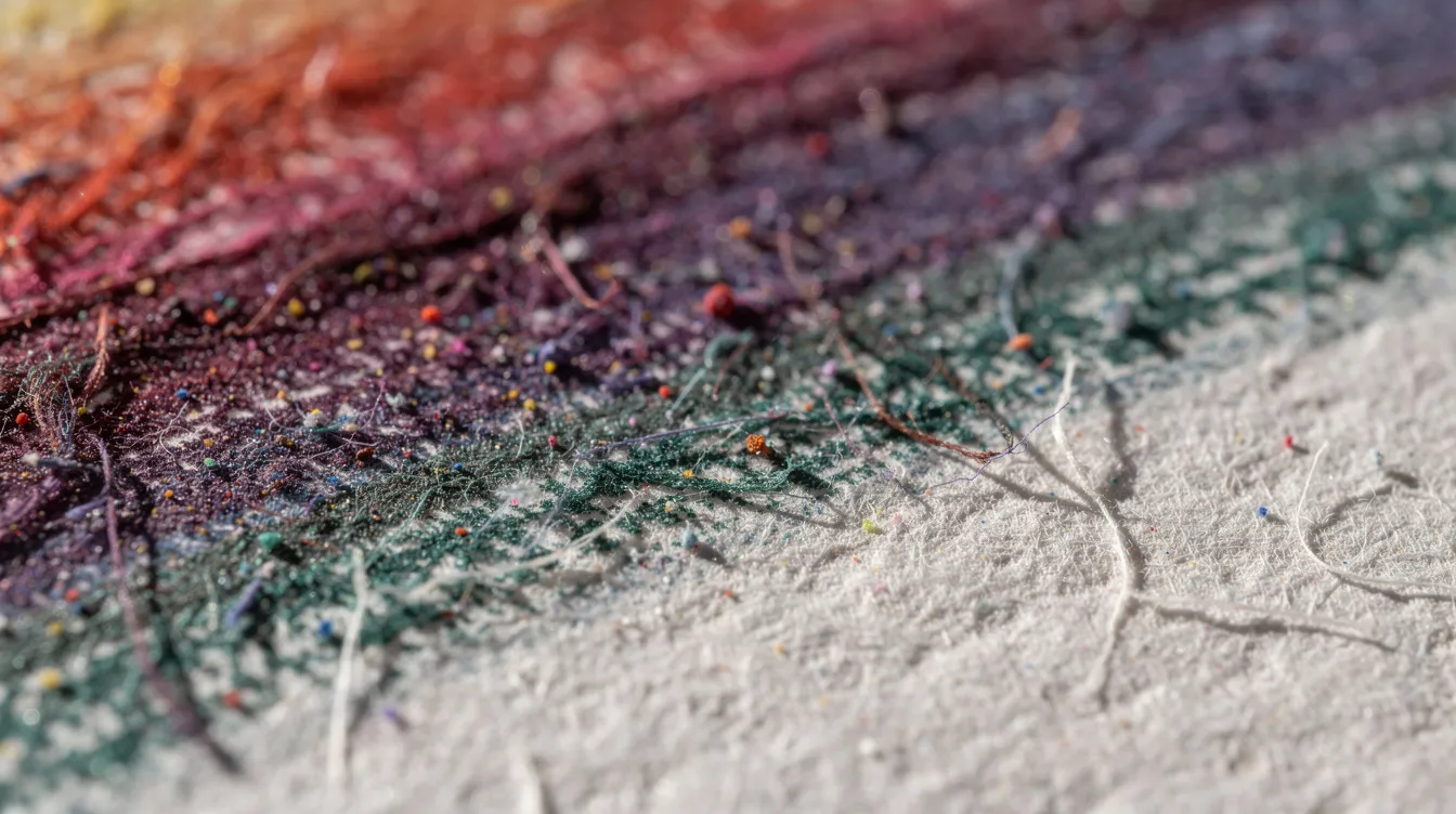
Pastel pencils are a different beast. They are like hard pastels in pencil form: dusty, soft, lovely for backgrounds and gentle transitions. Pastel pencils can be used dry or blended with other mediums. They smudge if you breathe on them, but that softness is a feature.
A note on spelling: “color pencil,” “colored pencil,” “coloured pencil” are all the same thing. I use the British spelling out of habit, but if you searched the American way, you are in the right place.
Gum based binders are found in watercolor pencils only, so those sit in a different category from dry pencils and pastels.
A quick summary of the three dry types this article covers:
-
Wax based: Soft, blendable, common, prone to wax bloom on heavy layers
-
Oil based: Firmer, less bloom, sharper detail, usually pricier
-
Pastel: Chalky, dusty, gorgeous for soft effects, fragile cores
Picking Pencils: Student Grade vs Artist Grade
Student grade colored pencils are the ones you find at supermarkets and discount shops for a few pounds. They have more filler and less pigment in the core, which means paler colour, more white paper showing through, and usually no published lightfastness ratings. Student grade pencils typically have a smaller color range of 24 to 36 colors, and they usually cost significantly less than artist grade.
Artist grade colored pencils have higher pigment concentrations than student grade. They feel smoother, lay down richer colour, and the best ones are tested for lightfastness so your finished pages do not fade on the wall. Artist grade pencils are generally softer and easier to blend, and artist grade colored pencils often come in sets of 72 colors or more, which gives you a wide color range to play with. You can also buy individual pencils in open stock, so you only replace the colours you actually use.
I started with a £5 tin from a charity shop in early 2024. Months later I added a few Faber Castell Polychromos from an art shop, and the difference was obvious. More pigment in the core, smoother laydown, less effort for vibrant colours. But those cheaper pencils still taught me everything about pressure and patience.
Expensive pencils will not make anyone a better artist. They only make the drawing process easier and more predictable. A small set of 12 to 24 is plenty to begin with. A huge tin looks lovely, but I keep reaching for the same handful of colours anyway. If you want a shortlist, I put together the best colored pencils to buy.
Student grade pros and cons:
-
Cheap, good for experimenting and large areas
-
Weaker colour, more filler, student grade pencils often lack lightfastness ratings
-
Cores sometimes brittle, wood can splinter
Artist grade pros and cons:
-
Richer pigment, smoother feel, higher lightfastness
-
Available as individual pencils for targeted shopping
-
Higher price, especially for a full set of artist grade products
Soft, Hard, Wax, Oil: How Pencil Feel Changes Your Colouring
A soft core feels creamy under your hand. It covers quickly, blends well, and fills the paper tooth in fewer layers. A hard core stays sharp longer, gives you crisp edges, and is better for fine details like leaf veins or tiny petals.
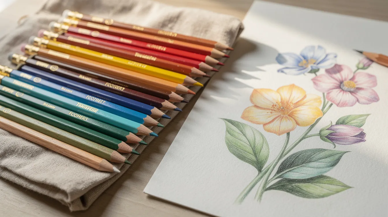
Prismacolor Premier is a good example of a soft, waxy pencil. It is buttery and rich, brilliant for skin tones and skies, but the core breaks if you look at it wrong and it needs constant sharpening. Faber Castell Polychromos sit on the firmer, oil based side. They hold a fine point longer, produce less wax bloom, and feel more controlled. A generic supermarket set is often hard but pale, because the core has more filler and less pigment.
The trade-offs are real. Softer pencils lose their point fast and can leave a waxy film. Harder pencils can feel scratchy and show more white paper if you use too light a touch. Oil based pencils are more durable and water resistant, which matters if your hands run warm or you live somewhere humid.
Here is when I reach for each:
-
Soft pencils: Skies, backgrounds, blending large areas, skin, anything that wants a smooth texture
-
Hard pencils: Fur, hair, sharp flowers, outlines, anywhere I want to create fine details
-
My usual approach: Start a layer with a harder pencil for a light base, switch to a softer one for blending, then return to the harder pencil to add details and define edges
Essential Tools Beyond the Pencils
Keep it cheap. A modest set of pencils, a sharpener, an eraser, and a stack of printed pages will keep you busy for months. Here is what actually helps:
-
Handheld sharpener with a lid: Use a good pencil sharpener for optimal performance. A decent one saves money by snapping fewer cores. Sharpen before you begin and whenever the tip looks flat, but not to a needle, which snaps and digs into the paper. A slightly worn tip actually fills larger areas faster and more evenly. Sharpen pencils to a fine point for detailed work, but for general colouring a moderate point does nicely.
-
Kneaded eraser: The Faber Castell one I use is soft and mouldable. It lifts graphite sketch lines and blots a little coloured pencil without tearing the paper. Sharp pencils provide better control and precision for detailed work, and a kneaded eraser gives you similar control for corrections.
-
Plastic eraser: Better for crisp lines and removing pencil guide marks.
-
Scrap paper: Always keep a sheet under your hand to stop oils transferring, and use another as a test sheet for swatching colours.
-
Colorless blender pencil: Not essential, but pleasant for smoothing transitions in a final layer without adding new colour.
-
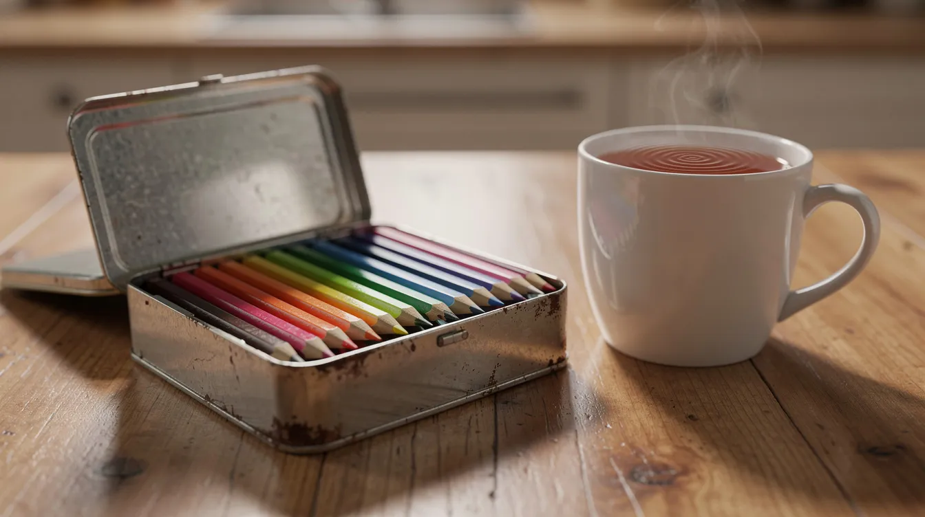
Pencil case or tin: Store pencils in a case to prevent breakage, especially if you carry them anywhere.
I do not routinely use solvents or sprays in my flat. Beginners can skip fixatives until they need to preserve finished art. A colored pencil fixative prevents wax bloom, but test it on scrap first.
Understanding Paper and Colouring Books
Choosing the right paper texture is crucial for effective colored pencil application. Paper “tooth” is the roughness of the surface. Smooth paper, like cheap copier stock, feels slick and does not grab much pigment. A slightly rough drawing surface holds pencil strokes better, lets you build several layers, and gives coloured pencil something to grip. Look for paper that is a bit thick and toothy, not shiny and thin.
I tested a few supermarket colouring books from 2024 and 2025. The cheap ones were around 70 to 80 gsm. Colour bled through to the next page, the paper dented under any real pressure, and two layers already looked patchy. Artist-designed books were often 120 to 150 gsm, and the difference felt obvious the moment I touched pencil to drawing paper.
Charity shops are brilliant for coloring books. I have found plenty of good ones for a pound or two. You can feel the paper weight before buying, and thicker always wins.
For home printing, try slightly thicker paper, around 160 gsm, for more layers and less warping.
Quick paper tests you can do in five minutes:
-
Press firmly with a saturated pencil and check the back for show-through
-
Swatch two strong colours side by side and see if they stay distinct
-
Layer three colours on top of each other and check for smoothness
-
Try erasing a mark to see how the surface holds up
-
Burnish a small patch and see if the paper goes shiny or stays toothy
If your book has thin pages, slip a spare sheet underneath to protect the next page.
Planning Your Colours and Light Source
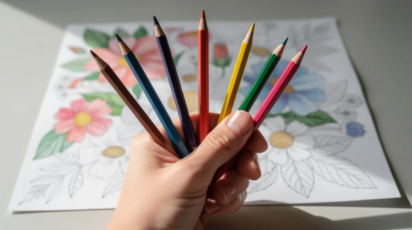
Choose a forgiving first page. Medium or large spaces work best, because tiny intricate patterns frustrate when your sharp pencil is wider than the gaps. I started with big leaves and a few flowers and felt satisfied rather than overwhelmed.
A light source is just deciding where the pretend lamp or sun sits so your shadows and highlights make sense. I mark it with a tiny pencil arrow at the page edge and erase it later. Every shape then gets a lighter side (facing the light) and a darker side (turned away). This alone makes flat shapes look round.
Understanding color theory helps in creating depth and richness in artwork. You do not need a degree in it. Just know that using complementary colors as underlayers enhances the vibrancy of the main color. A light wash of red under green leaves, or a hint of purple beneath orange, gives the top colour a glow that a single flat layer cannot match.
For a simple page I lay out four to six pencils: two main colours, a lighter shade of each, and one dark for shadows. For bigger pages I pull eight to twelve from the tin so I am not rummaging. A limited palette makes a page look planned rather than chaotic.
Cannot decide on colours? Pick one from a favourite mug or tea towel and build around it.
Swatch your choices in the margin or on a scrap sheet. Light colors and dark colors both look different on paper than in the barrel, and blue layered over yellow can surprise you. A thirty-second test saves regret.
Prep steps before you colour:
-
Sharpen all pencils you plan to use
-
Swatch on scrap with light, medium, and firm pressure
-
Mark your light source with a small arrow
-
Choose your page and gather tools (eraser, scrap paper)
-
If printing, tape the page flat so it does not curl
Core Pencil Techniques for Smooth Colour
The difference between pressing hard at first and starting softly is enormous. Your first layer should look pale, and that is fine, because adding colour is much easier than removing it. Avoid pressing too hard with colored pencils to maintain paper texture for layering.
Think of pressure like writing. Sketchy note pressure is what you want for most of the drawing process. Pressing hard, like signing a form, comes much later, if at all. Light pressure gives you room to adjust, while heavy pressure locks colour into the paper early and leaves nowhere to go.
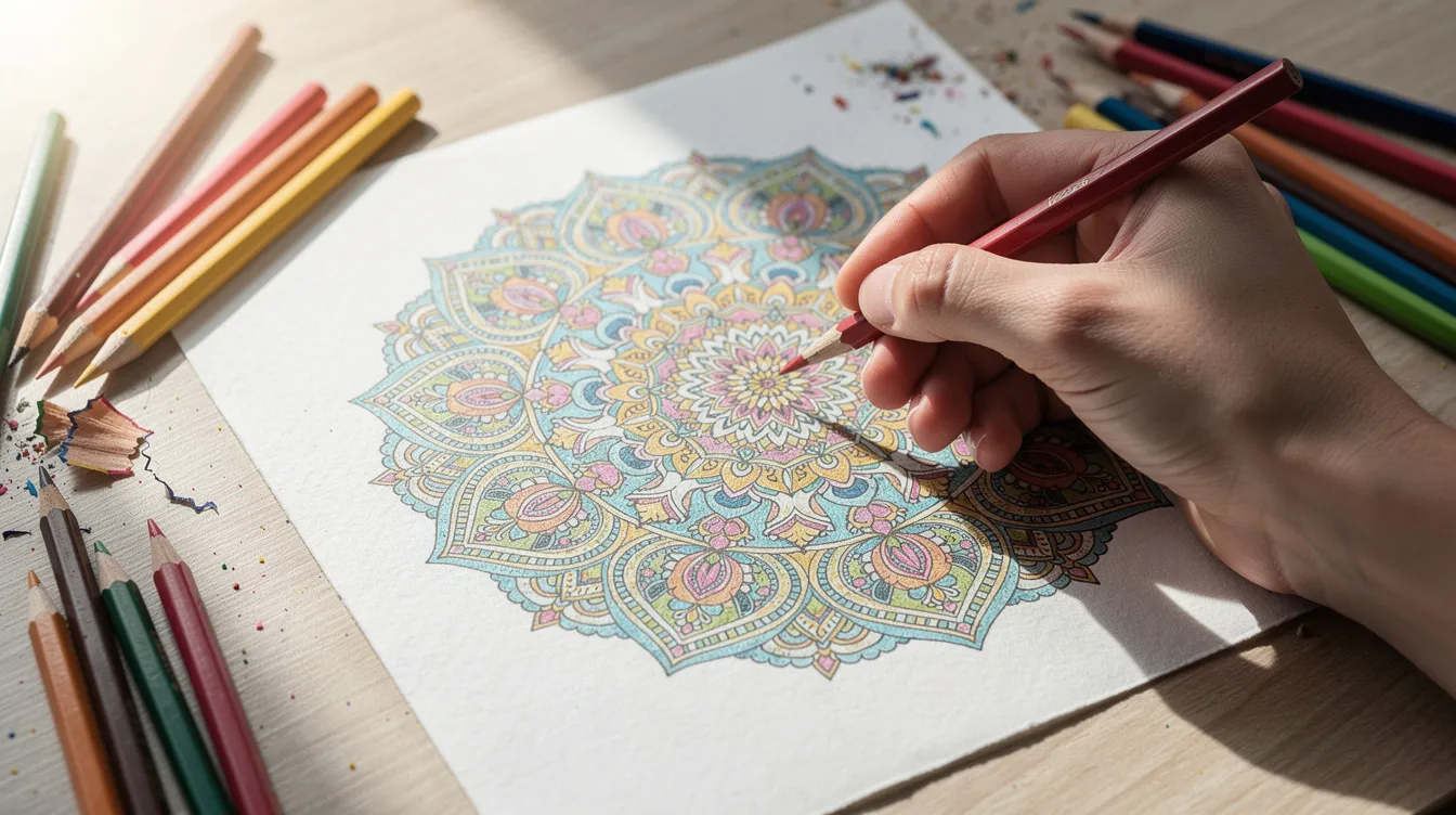
Use small circles or zigzag lines for colouring. Using circular motions produces smoother color application and reduces streaks. Light layering using circular strokes helps build colour gradually and keeps the surface even. For skin, skies, and other areas that need a smooth texture, soft strokes in gentle overlapping circles work better than straight lines.
Keep your pencil strokes consistent within a shape for a smoother finish, then shift the angle slightly on the second layer. If the first pass goes left to right, try top to bottom next. When tired, a loose, gentle scribble works too.
Change your pencil angle depending on the job. The side of the lead gives broad, soft coverage for backgrounds. The point lets you add details like eyelashes, leaf veins, or tiny patterns. Rotating the pencil as you work keeps the tip even.
You can also use a white pencil for a solid underlayer before adding colour. This fills the paper tooth slightly and makes the colour on top look smoother and more even.
Three habits to build:
-
Light hand: start every layer gently
-
Many layers: three light passes beat one heavy one
-
Slow build: patience is the only real technique
Layering, Blending and Burnishing Without Overthinking It
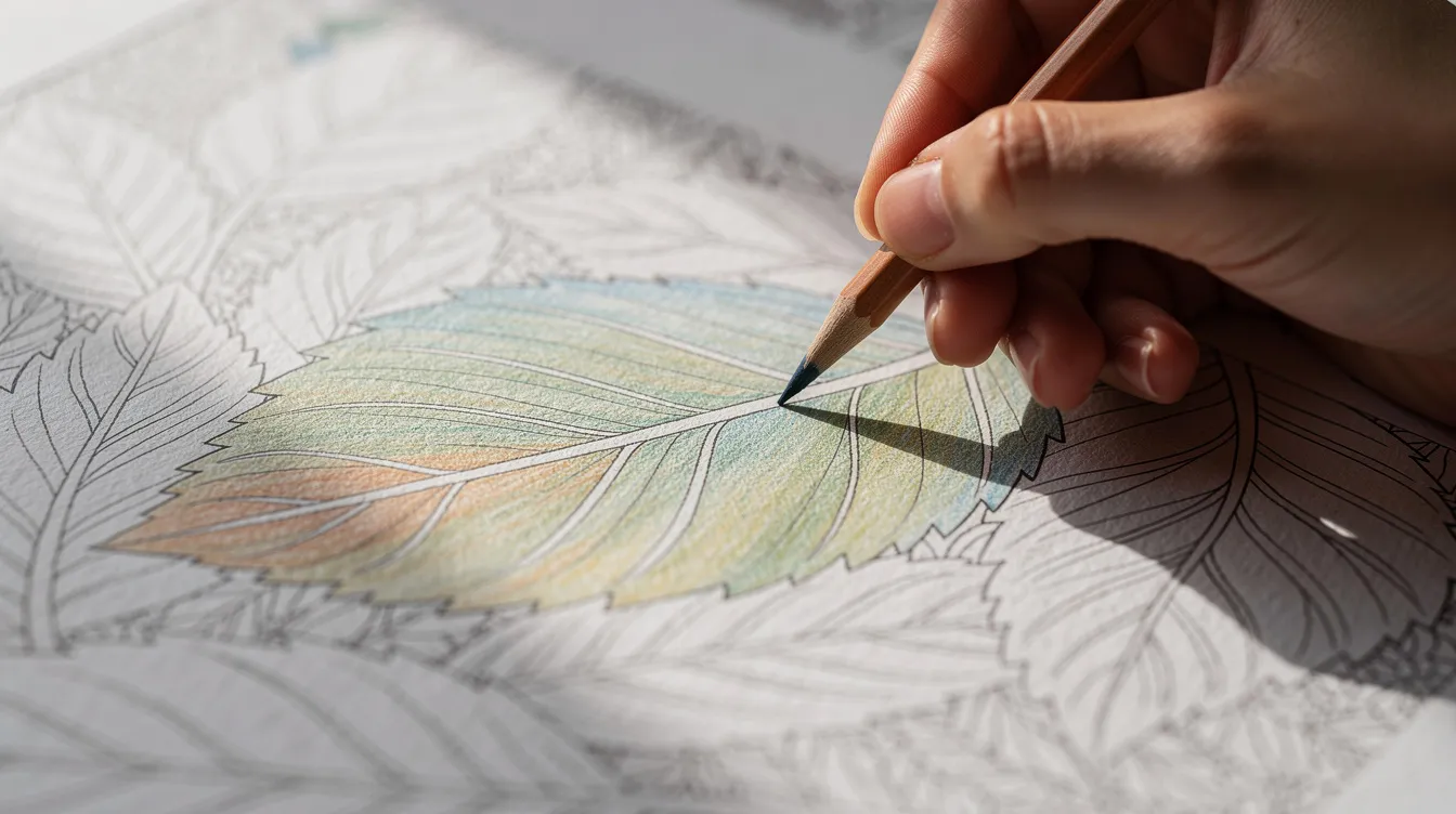
Layering is the main colored pencil technique. Think of it as stacking sheets of tinted glass: each layer adds depth without hiding what is underneath. In my experience, three light layers always beat one heavy stroke. The first lays a base, the second adds mid-tones, and the third sharpens contrast. Layer colors gradually for realistic shading, and you will see the difference quickly.
Always work light to dark, especially in the beginning stages. Dark colours pressed early fill the paper tooth and close the drawing surface, so later layers slide off or look patchy. My leaf example: pale yellow-green over the whole shape, mid green toward one side, then dark green or even a touch of blue along the edge for shadow. Building layers slowly prevents flattening the paper’s texture, which keeps the surface ready for each additional layer.
How many layers can you add? It depends on the paper and the pencil, but most pages take three to five comfortable layers before the surface starts to resist. If the paper feels slick, you have reached the limit. You can always add more layers on toothy paper with firm pencils, but the tooth eventually fills.
To blend colors where two shades meet, use very light pressure with a mid-tone pencil between them, or simply overlap the edges gently. No blending techniques require special tools at this stage.
Burnishing means applying more pressure with a light or neutral pencil on the final layer to squash pigment into the paper. Burnishing compresses pigment for a smooth, glossy finish but limits further layering. Burnishing smooths color and removes paper texture, so save it for the very end. Burnishing requires heavy pressure to smooth layers, and you should only do it once you are happy with your colours.
Rich color saturation with colored pencils requires pressure control and layering techniques. Apply more pressure for saturated tones only after you have built up enough layers to support it.
Do’s and don’ts for blending and burnishing:
-
Do build at least two or three layers before burnishing
-
Do use a white pencil or colorless blender for the final pass
-
Do not press hard in the first two layers
-
Do not burnish and then expect to add more colour on top
-
Do step back and check your page from arm’s length before committing to that last heavy layer
Using Shadows and Highlights to Make Pages Pop
Values, meaning lights and darks, matter more than finding the perfect colour in the tin. Even if your hues are slightly off, good contrast makes a page look alive.
Deepen shadows by glazing darker colours over existing layers. I add deep blue or dark purple to shadows rather than just more of the base colour. This keeps the shadow area interesting and stops it looking flat. For highlights, leave a little strip or dot of untouched paper, especially on shiny things like cherries, cups, or raindrops. That bare white reads as a bright reflection.
Do not outline everything in dark first. Heavy, uniform edges make a page look stiff. I let the printed lines do that work and reserve my darkest pencils for where light naturally casts shadow or an edge turns away from the light source.
My teapot example from January 2025: I used a simple three-step value plan. The side facing my imaginary lamp got barely any colour, just the lightest touch. The middle got a comfortable mid-tone. The far side and underside got dark colors glazed over the mid-tone. Three values, and the teapot looked round. It was the most satisfying page I had finished in weeks. Many artists use this same approach in their own drawings, from hobby colourists to any professional artist working in colored pencil art.
Quick checklist for shadows and highlights:
-
Choose a light side (near the light source)
-
Push the dark side with glazed darks, not just heavier pressure
-
Protect a tiny bright edge or dot for the highlight
-
Squint at your page to see if values read clearly
Fixing Mistakes and Dealing With Wax Bloom
Coloured pencil is not truly one of the erasable colored pencils in the way a graphite line is. But you can lighten, soften, or disguise most mistakes. The best fix is working lightly at first, so a wrong colour is easy to cover. The second best fix is turning a mistake into a shadow or pattern.
Use a kneaded eraser to lift too-strong shadows and tidy fuzzy edges. Switch to a plastic eraser for graphite guide lines. A bit of sticky tack can dab off excess pigment in small spots.
Mistakes I made so you do not have to: pressing too hard too early fills the hollows of the paper and makes it impossible to fix. Using every colour in the tin turns a page into mud. Rushing for twenty frantic minutes creates more problems than twenty relaxed ones. I lost a whole flower spread in spring 2025 because I burnished too soon and could not add more layers to fix the patchy petals. I learned coloured pencils learn to punish impatience.
Stop before you think you are finished. Step back to arm’s length, because pencil work can look uneven up close and lovely from a distance. I used to keep fiddling and make things worse. Now I set a page aside, make fresh tea, and return later with clearer eyes.
Wax bloom is a misty white film that can appear on heavy wax based layers after a few days, especially on dark backgrounds. Oil based pencils show less wax bloom than their wax based counterparts. Gently wipe bloom with a soft cloth or tissue, then add a light layer if desired. A colored pencil fixative prevents wax bloom if you want to preserve finished art, but always test the spray on scrap first.
Mistake triage steps, least to most aggressive:
-
Relax. Set it aside.
-
Look at it from a distance.
-
Gently lift colour with a kneaded eraser.
-
Layer a mid-tone or complementary colour over the area to soften it.
-
Glaze a darker shade to turn the problem into a shadow.
-
Accept the imperfection. Some of my favourite pages have a wobbly bit that makes them feel real.
Trying Pastel Pencils Alongside Coloured Pencils
Pastel pencils are a soft, chalky partner for hazy skies, bokeh, or gentle backgrounds behind detailed line art. Their softness is a feature, not a failure, though they smudge if you so much as brush them with your sleeve.
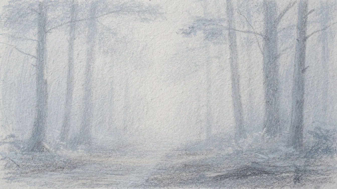
In mid 2025 I tried pastel pencils for the first time on a forest page with pine needles and early morning fog. I used pastels for the mist and distant trees, then came in with coloured pencils for the sharp branches in the foreground. The contrast between soft distance and crisp detail gave the page a sense of depth I had never managed before. It was a small discovery that changed how I think about layering colors on a single page.
Keep a scrap sheet under your hand and tap dust gently into the bin rather than blowing it across the page. I sometimes block in a pastel background, fix it lightly with workable fixative at the window, then return with coloured pencils for crisp details on top.
Tips for pastel pencils:
-
Layer pastels first, then fix, then add coloured pencil detail
-
Use harder pastel pencils for any fine work, softer ones for broad washes
-
Expect mess. A damp cloth nearby helps.
-
Pastel pencils pair well with other art mediums on mixed-media paper
Mixing Sets, Brands and Learning From Other Artists
Mixing pencils from different sets is completely normal. I use a budget tin for big areas and a few open-stock artist grade pencils for accents and shadows. The variety compensates for weaknesses in either set.
My favourites right now: a cool dark from Faber Castell, a creamy white from another brand, and some no-name pencils from a Sheffield market stall that surprised me with a warm ochre I reach for constantly. None of these came from the same box. Buying individual pencils to fill gaps in your collection is cheaper and more useful than replacing a whole set.
Watching other hobby colourists on blogs, social feeds, and YouTube gave me colour combination ideas without needing to copy every stroke. I notice someone using mint green, grey, and peach together, and I try something similar on my next page. YouTube videos and video lessons from other artists are good for seeing pencil techniques in motion, though I prefer watching at my own pace rather than following along rigidly.
Do not compare your pages harshly with polished colored pencil art online. Many of those pieces took weeks or months and used dozens of artist grade pencils on premium drawing paper. Instead, notice one thing you like and one thing you might try differently. Growth is gradual. Each finished page teaches something about pressure, palette, and values.
Ways to learn while keeping your own style:
-
Watch one technique, not a whole tutorial, and try it on scrap
-
Save colour combos you admire, then adapt them to your own drawings
-
Share a finished page with a friend or online if it feels good
-
Accept that other artists have different tools, time, and experience
Building a Relaxing Colouring Habit
Pencil rewards patience. I colour after early bakery shifts, with a pot of tea, at my small table. Twenty to thirty quiet minutes of layering colors most afternoons is my routine. I treat a page like a cup of tea: no rush.
Keep pencils and a book somewhere easy to reach so starting feels small and comforting, not like setting up a studio. I leave one book and a small pencil case next to my chair. Seeing them invites me to pick them up, even for five minutes.
Colour a small section each day instead of trying to finish whole pages in one go. Over weeks, the pile of finished work grows by itself, and you feel the progress without forcing it.
Concrete goals if you want them:
-
Finish one page a month
-
Try one new pencil technique per week (blending, burnishing, pastel work)
-
Test one new colour combo on scrap before bed
If you like company while you colour, the Kettle’s On page is where I share what I am working on and what is in my teapot. It is a quiet corner, no pressure.
Every page you finish, even the ones with a muddy patch or an edge that wandered, is part of the story of your colouring books. Enjoy the slow pace. Put the kettle on. Start light.
Next steps for a beginner:
-
Gather what you have: any pencils, any page, scrap paper
-
Try one page this week using light pressure and two or three layers
-
Swatch your favourite colours on a test sheet before you begin
-
Set a timer for twenty minutes and stop when it rings
-
Come back to the page tomorrow with fresh tea and fresh eyes
FAQ
Do I need expensive pencils to start colouring with pencils?
No. Any set that lays down colour without scratching the paper is fine for a first try. Student grade pencils usually cost significantly less than artist grade, and they are perfectly good for learning pressure, layering, and colour mixing. Spend more once you know what you enjoy and what frustrates you. A professional artist might need premium pencils for commissioned work, but a hobbyist does not.
Why does my colour look patchy?
Usually pressure or direction. Use lighter, slightly overlapping pencil strokes and build two or three layers on paper with a bit of tooth. Changing the angle of your strokes between layers also helps. Using circular motions and small circles smooths things out more than straight lines do.
Can I fix a mistake?
Sometimes. A kneaded eraser lifts light layers a little. Sticky tack dabs off excess. But heavy colour rarely comes out fully, so the practical move is to turn it into a shadow or pattern. Prevention is better: work lightly in the beginning stages and press hard only at the end.
How long should a page take?
There is no right answer. An hour or two for a simple page. Many sittings for a detailed one. It is absolutely fine to come back to it over days or weeks. Relaxation comes in the process, not in finishing quickly.
Should I colour inside the lines or not?
Whatever feels good. Staying neatly inside is a nice skill to practise. A wobbly edge adds charm. I do both, depending on my mood and how much tea I have had.