Short answer: light overlapping layers, a sharp point, the lighter colour first, and patience over pressure. That is most of it. The rest is what I have found works with the colors in my tin, and why my first few pages looked like someone ironed a crayon.
Quick Answers: What I Mean by Colours Blending
Colours blending is the process of combining two or more colours directly on the paper with layered pencil strokes so you get a soft transition instead of a hard edge where one colour stops and the next starts. With coloured pencils it is slower and drier than paint, but the aim is the same: smoother gradients and nicer-looking pages without obvious bands.
This is not the same as pre-mixing. If I swatch a warm red and a cool blue on scrap paper to choose a plum before a big background, that is color mixing. You mix on a palette, or test pencil combinations on spare paper, before you start. Blending happens live, while you colour, and in this post I’m looking at that difference, simple pencil-blending methods, when markers can help, how to plan colours so they do not turn muddy, and what to do when a blend goes wrong.
All of this comes from my own experiments at my small table in Sheffield since winter 2024. My first charity shop book had a few pages I wrecked by scrubbing two pencils together until the paper shone. I write for adult colouring hobbyists, especially beginners and anyone coming back to colouring, so this is plain, practical advice rather than art-school theory. I found that smooth blending takes gradual layers, not too much at once, and that getting the hang of it makes colouring more enjoyable as well as improving the result. If you are brand new, read how to start colouring with pencils first.
Blending vs a Color Mixer: How Color Mixing Combines Colors on the Page
Beginners use “color blending,” “color mixing” and “color mixer” as if they mean the same thing. They do not. Shade from light blue to pink in a Johanna Basford floral and the middle reads as a soft lavender. You create that colour right where it sits, and the blend never leaves the paper.
A digital color mixer is another thing. Pixlr’s color mixer adjusts RGB channels on screen, and Trycolors offers automatic mixing recipes. RGB is how a screen builds colors from red, green and blue light, and these tools show RGB values as numbers, so an RGB swatch on a phone display will rarely match a pencil exactly. I still use a website like that to plan a palette, allowing me to try three or four colors before I touch the paper. Digital users get a lot out of blending modes, but with pencils it is all by hand.
A paint color mixer combines pigment in a wet puddle on a palette, and color mixers let users mix colors in different quantities, which suits paint more than pencils. Pencils mix in layers. Most of my finished pieces use both: a sunset sky where orange melts into coral and then purple, beside a geometric pattern of separate colors with clean edges.
Practical Color Blending Techniques with Pencils
I use budget pencils like Staedtler Noris Club and mid-range sets like Faber-Castell Polychromos. Softer, waxier pencils blend more easily because they lay down more pigment. If you are still deciding what to buy, my guide to the best colored pencils covers it, and it explains which features matter, such as a soft core and a decent number of shades, which new users often overlook. For wax versus oil cores, the colored pencil overview on Wikipedia is a decent start.
Here are the blend steps I follow for two colors:
-
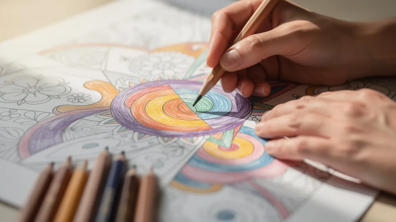
Step one: a light base layer over the whole shape in the lighter colour, with feather-light pressure.
-
Step two: bring colour A from the left and colour B from the right, allowing them to overlap in the middle.
-
Step three: go back over the join with the first colour, very lightly, to smooth the transition.
-
Repeat until the hue looks even, in tiny circles or a tight zigzag, like sweeping steam off a cup of tea. If you switch to wet paint, work quickly so you do not overwork the surface.
An artist can create smooth gradients with an intermediate colour between two hues. Going from blue to green, a teal in the middle feels natural. Following these blend steps with a pale yellow or cream from your tin gives you a homemade color blender, and white softens brightness as well. A colourless blender pencil is optional. I often get a perfectly nice result without one.
Glazing means thin, transparent layers over a dry layer. Yellow over turquoise will mix a fresh spring green without owning that exact pencil, so this is how you create custom colors your set lacks. Optical mixing helps too: colours blending in fine layers appear smooth from a distance, even when the strokes show up close.
Pressure comes in three rough levels: feather light for the first two layers, medium for building depth, and firm only as the last step, when you burnish. I build up by changing the pressure only a little between layers. Beginners jump to firm too soon and get a shiny surface that will not take more colour. Save burnishing for glass bottles or gemstones where you want a polished display.
Paper matters as much as the pencil. Thin, smooth paper in a £4 supermarket book fills after two or three layers, while thicker, toothier paper gives room for five to eight. At the back of each book I draw a small gradient as a mini color mixing chart, which aims to show every possible color combination, even though pencil blending still happens in layers on the page, and I check it under lamp light since brightness keeps changing with the bulb. My Supplies page lists the pencils, papers and extras in my own tin.
A digital color mixer is another thing. You can pick a colour by clicking the wheel or swatches, or by typing the values directly, including saturation. RGB values help if you need the same screen colour again. A decent digital tool may work on any device and lets you save or recreate a colour later without guessing next time. Digital users get a lot out of blending modes because they can enhance textures and recolor objects in designs.
Blending with Markers and Mixed Supplies
Many users combine alcohol markers or fineliners with pencils, and blending behaves very differently with wet ink. Overlap two markers from a cheap set while still wet and you get a smooth ombre on a large flower petal. If your set is small, run a pale grey or colourless marker over two neighbouring colors to soften the line between them.
Pencils over markers let you add subtle custom colors. A pale peach pencil over a flat pink marker is what I have found knocks the tone back, letting me mix a softer skin tone and adding blush only where needed, making it look more natural. Changing to a pencil for the small details keeps control. Some markers have dual tips, and features like a brush end are handy for tiny areas.
Bleed-through tips:
-
Slip a spare sheet behind the page.
-
Test new brands on the last sheet of a bargain book.
-
Water-based markers can warp thin paper, so keep those blends small.
Write the marker number and pencil names next to each test so you can match them later. A messy test sheet becomes a personal color mixing chart that is effective at saving you from repeating a muddy mistake. I take a photo of mine and save it in whichever formats my phone offers, though phone photos look brighter than paper because screens use RGB light.
Planning Custom Colors, Palettes, Avoiding Mud and Enjoying the Process
A little planning saves a page from going muddy, especially on big backgrounds or after an early shift at the bakery. Colors interact according to hue and intensity when you mix them, and if you pile on too many unrelated hues the result is a dull grey. Taking the paper’s tooth into account helps as well. If you plan on a screen, an RGB palette will glow brighter than your pencils, so test a real swatch first.
Here is a quick way to keep things clean:
-
Pick three to five colors per page, and never mix more than three in one patch. A trio like teal, coral and warm grey for an autumn leaf spread keeps the palette tight.
-
Use a colour wheel. Complementary colors sit opposite each other, and mixing them mutes both, so blend neighbours (yellow to orange, blue to purple) and be cautious with opposites. Knowing your primaries, red, yellow and blue, helps you choose confidently, because mixing two primary colors gives a secondary.
-
For shadows, try a darker version of the same hue, or a warm brown or deep blue. Darker shades are made by adding black, but pure black can look flat in a drawing, so I choose deep navy or dark plum, which is usually a better match.
Rescue ideas when a blend goes wrong:
-
Add a darker glaze over the area to unify a patchy sky.
-
Lift a bit of fresh pencil with a kneaded eraser.
-
Cover a disaster with intentional shadow and move on.
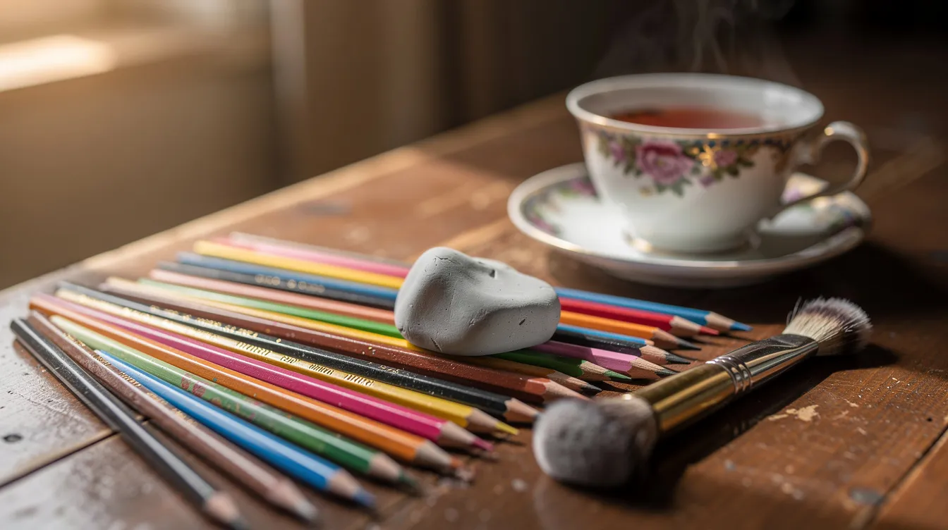
One more step that took me too long to learn: brush off pencil crumbs with a soft brush rather than blowing or smearing. I keep an old makeup brush by my tea tray. Sweeping them with your hand drags pigment across the sheet.
Colour blending can create lovely effects, but perfect is not the point, and a perfect gradient would look a bit dull anyway. The point is that the page looks better than it did ten minutes ago and the tea is still warm. Make a pot tonight and take the first step: pick one small section and start a new blend. If it goes wrong, call it shadow. I keep my favourite pieces on display by the kettle, and I would love to see a photo of yours.
FAQ
These are the questions I get asked most.
Do I need a blending pencil? No. A colourless blender can help, but the lightest pencil in your blend, with gentle pressure, works well. Try that first and only choose a special tool if you find you need it.
Can I blend cheap pencils? Yes, though it takes more work. Less pigment means more layers and the paper fills sooner. Go slowly with light pressure and sharp points. You can download free practice sheets from any colouring website to experiment on without risking a good book. My guide to colored book pages explains what those sheets are and how to use them.
How many layers should I use? There is no fixed number. I do three to five light layers and stop when the shades look even or the paper turns shiny. Harder pencils may need more.
Why do my colours look streaky even when I blend? Strokes are usually too heavy, too spread out, or all in one direction. Use smaller overlapping circles, a sharper point and lighter pressure. Applying colour in one way and then changing direction on the next layer helps fill the tooth.
Which direction should I colour in? Whichever is comfortable, but stay consistent within a layer and shift slightly between layers to hide earlier marks. Some people prefer small circles, others a gentle back and forth. Neither is wrong, and any artist will tell you to stay light at the start and let the layers do the work.